Historical Movement Poster :
Fall 2001-2002
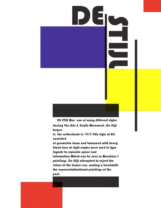
We had to design a post of a past Historical event. So I chose The Destijl Movement. We first had to do some research of this eara and com up with a post which would convey that. This all had to be don in QuarkXpres as well as using othersoftware.It had to be in B&W an done out on a 11x17 sheet of paper.Well our teacher had us save all info to a disk and go to a place like Kinkos to print it out I did 2 this one in Color and another in B&W
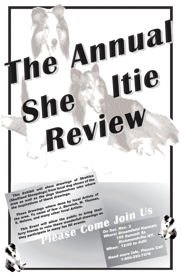
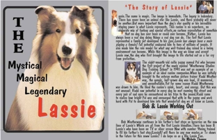 As students we had to create a two-page spread using facing pages in Quark. The document had to be set up as two 8˝x11 facing pages to create an 11x17 document. The we had to select a celebrity of historical figure that you can find sufficient data on. The we had to write 2 to 3 paragraphs about this celebrity which would be included in the spread. This celebrity had to be well know not one that was obscure.We had to inclued in this spread the following: one image, photograpg,illustration or drawing of celebrity, 2 or 3 paragraphs of text,a headline(in Large type) and a sub-heading as well as the importance of hierarchy, contrast,alignment,repetition,proximity and the us of white space.